Why?
Common wireless systems rely on a some form of radio waves. These waves are differentiated by frequency bands(Hz) so that they have a particular use case that can fit the benefits of the band.

Lower frequency bands have a longer range but are more affected by obstructions and have less data bandwidth while Higher frequency bands have a shorter range but are less affected by signal obstructions and have more data bandwidth. For example, WLAN(WiFi) uses a form of radio waves in either the 2.4 GHz, 5 GHz or the newer 6 GHz bands while applications like navigational radio beacons and transoceanic air traffic control use a much lower frequency band.
The problem comes when trying to actually understand these various signals around you. You often need to either become a near expert or spend most of your time studying radio technology to fully grok it. Plus, you won’t know if you may need specialized radio equipment. Why can’t we have a flexible way to visualize it to have a point of entry in understanding these signals? e.g At this particular time(and/or location), this frequency band is the strongest by the looks of this graph because the color is stronger.
The project
Hence, Balena RTL Power, a project to visualize and analyze signal frequency bands in a more simple and general way. This will be using a Software Defined Radio(SDR), rtl power and balena! A brief overview of the project:
Block diagram:

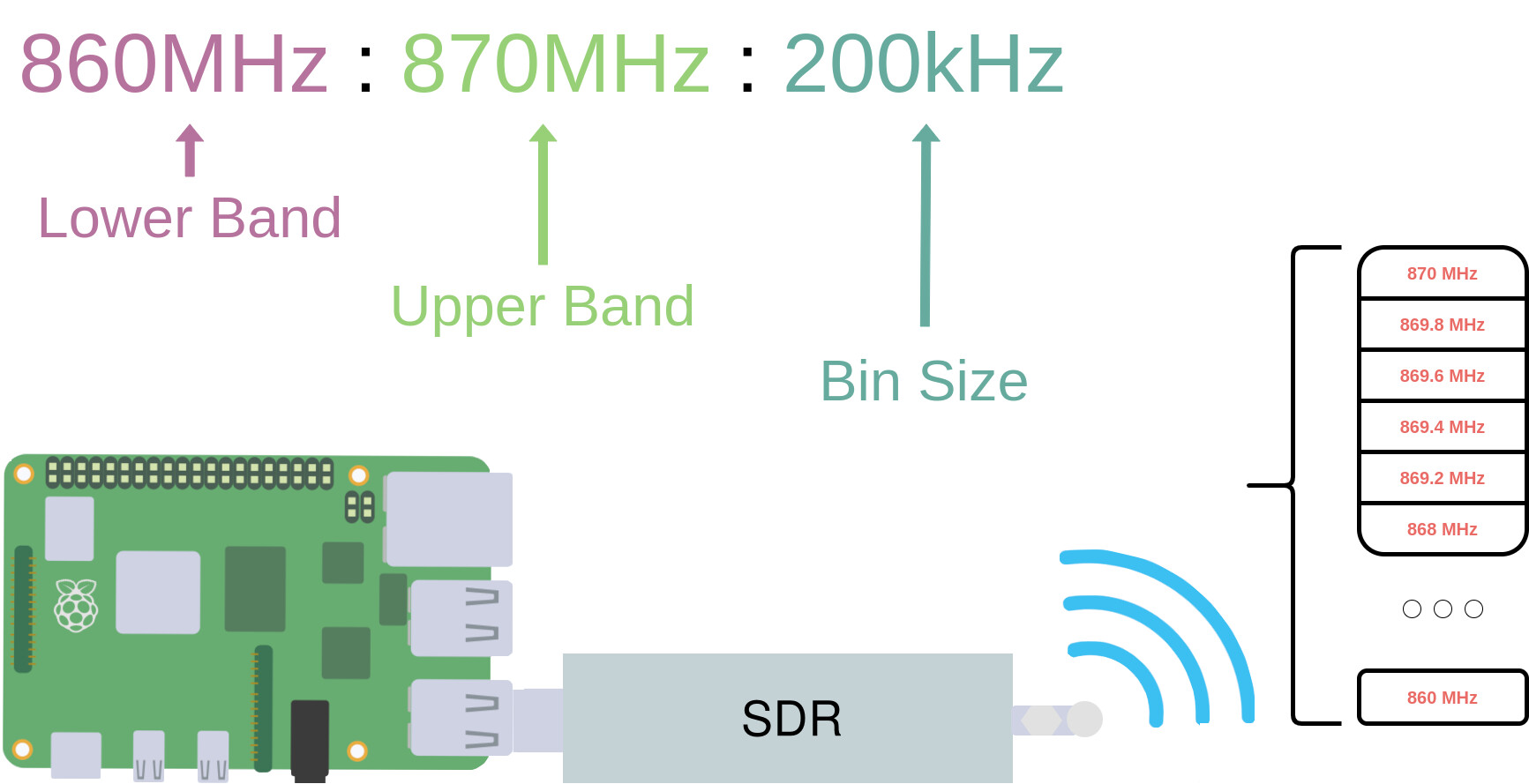
- RTL-SDR - A cheap SDR thats a great starting point in working with SDRs. An SDR is a really useful and flexible system in which radio configuration is easily done through software where originally it was done through different hardware. So, 5+ radio hardwares for analyzing low-band to high-band frequencies becomes only 1 hardware with an SDR.
- rtl_power - the software that configures how the SDR will operate. It configures what range of frequencies to cover, at what tuning, and also outputs the data that is being read.
- grtlp - a wrapper function I wrote in Golang so that the data can be sent through MQTT
- MQTT - a lightweight messaging protocol that is suitable for IoT usecases.
- Connector - a balena block that automatically connects data sources with data sinks e.g, mqtt to influxdb.
- InfluxDB - InfluxDB is a time series database that is ideal for data such as sensor readings or our signal power data.
- Dashboard - The primary output of this project. We will be using balena-dash, which is a balena block that provides a Grafana dashboard where you can easily visualize your data on your browser. This iteration’s output will primarily be a Grafana heatmap to properly visualize the power of each frequency band at a certain time. Each band will be it’s own row and the color intensity of a block will represent the power. Sort of like this:
Where the top row is the higher frequency band and the lower frequency band is at the bottom row.

That’s all I have for now. I’ll be posting more details of the project and update as I move along!